Bubble Chart Enhancements and Redesign
London Stock Exchange /
Yield Book
PROJECT SUMMARY
Redesign of portfolio analytics bubble charts based on accessibility standards and prospective client feature requests:
- Color gradients optimized such that differences could be seen by colorblind users
- All bubble sets uniquely styled for all interaction states, recognizable to all users
- Functionality added to identify multiple subsets within a set of bubbles, based on input criteria
My Role
UX Strategy
- Consolidated multiple client requests and fixes for known usability issues into discrete, manageable design requirements
- Proposed project scope and gained buy-in from product manager and business stakeholders
- Defined color analysis framework and color selection process
Visual & Interaction Design
- Defined bubble styling (multi-series base colors, portfolio vs. benchmark, selected vs. unselected)
- Defined in-chart navigation and view-state interactions
- Defined UI component styling, including icon buttons for chart controls
- Produced high-fidelity mockups, visual design specs, and interaction specs
Outcomes
- New client signed immediately following launch, generating $XXXK annual revenue
- Positive feedback from users and stakeholders
PROJECT DETAILS
Within Yield Book Q, the primary product I worked on at Yield Book, one of the core sections was Portfolio Analysis, a set of tools for conducting investment risk analysis for fixed income portfolios that could consist of mortgage-backed securities, treasuries, corporate bonds, and various other security types.
One such tool was a bubble chart, in which bubbles would represent...
- Portfolio "sectors" (i.e., segments based on security meta characteristics or performance metric buckets)
- Individual securities (aka "issues") within a sector
Users could customize the charts to assign various metrics as values for...
- Chart x-axis
- Chart y-axis
- Bubble size
- Bubble color intensity
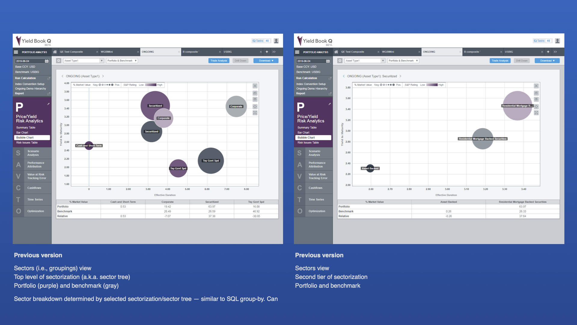
In addition to sectors or securities in a given portfolio (at the time shown in shades of purple), bubbles could also represent comparison sectors or securities in an index or other benchmark (at the time shown in shades of gray).

Bubble chart Sectors view at the start of the project (built before I joined the company)

Bubble chart Issues view at the start of the project (built before I joined the company)
Prior to the project, we had already identified some usability issues with the bubble chart:
- For some color gradients, it was difficult to differentiate between the purple portfolio and gray benchmark bubbles, especially for color blind users
- The bubbles could be selected for analysis or to aid in navigation, and in the selected state there were no visual indicators to show which bubbles represented the portfolio and which the benchmark
- Sectors could be defined as part of a multi-tier "tree" (e.g., country: industry), and the user could navigate through the various branches of the tree. Constituent securities could only be viewed for the lowest sector-branches in the tree, accessed via navigation "below" the given sector.
(In the example above, one could view the constituent securities for a given industry within a country, but not for the parent branch country or for the portfolio as a whole.)
This was the state of the bubble chart at the time I joined the company.
During my tenure as lead designer, a prospective client asked for a number of changes as a condition of entering a contract:
- The ability to view the constituent securities of any displayed sector (not only those in the lowest branch of the sector tree)
- The ability to highlight securities in a sector (or portfolio/benchmark as a whole) matching various user-defined characteristics, as a subset of all securities in the sector
- The ability to display multiple such subsets together
It should be noted that Yield Book is an extreme example of a high-cost / low-volume business, so the demands of individual clients weighed heavily in product decisions.
Initial Requirements
I consolidated the various client requests and usability fixes into discrete design requirements, which I proposed to the product manager and business stakeholders as the basic project scope:
1. Redesign UI and navigation to allow...
- Viewing of issue-level data in any sector (not just lowest in branch)
- In single view, display of issues that match attributes (subsets) in addition to all issues (full set)
2. Define new single-series bubble chart color and color palette for multi-series bubble charts
3. Restyle bubbles to allow differentiation, by both colorblind and normally-sighted users, of…
- Unselected series vs. series
- Selected series vs. series
- Unselected portfolio vs. unselected benchmark (same series)
- Selected portfolio vs. selected benchmark (same series)
- Individual same-style bubbles in a cluster
The one major constraint was a requirement to use colors from a previously approved color palette.

Existing color palette
I also chose to keep the existing benchmark gray gradients and selected state colors, if possible.
Color Analysis and Selection
As a first step to assess the various colors in the palette, I conducted a gradient contrast analysis for each.
First, I created grids to view thecontrast between every gradient of a given color and...
- Every gradient of the benchmark color
- Every gradient of other colors in the palette
I then ran the resulting grids through color blindness simulators to assess contrast for various types of color blindness.

Gradient contrast analysis
Following the color analysis, I chose a primary chart series color based on...
- High contrast of gradients vs. benchmark gradients
- High contrast of gradients vs. selected state gradients
- General aesthetics
I also discarded any colors from the palette that were too similar to others with explicit or implied meaning, such as an error state, selected state, etc.
I then chose additional chart series colors based on the same criteria as above, in addition to contrast vs. the primary series color.

Bubble color analysis framework
Bubble Styling Explorations and Early Mockups
After selected a color palette, I explored a number of styling options.


Bubble styling explorations and early mockups
A triple-border color scheme quickly emerged as a solution for distinguishing the various states for multiple series of bubbles.


Triple-border bubble explorations
View Settings and Client Feedback
The initial view settings I devised used basic radio buttons to toggle between...
- Sector view, with options to display the sub-sectors and/or the total for the currently visible sector
- Constituent issues (i.e., securities) for the currently visible sector, also with the option to display the total for the sector
In "Issue" view, the user could then choose whether to display subsets based on certain characteristics, using a checkbox control similar to one we had used elsewhere in the application for a multi-series line chart.
This is the version we presented to the potential client for feedback.


Designs presented to potential client for feedback
Production Version
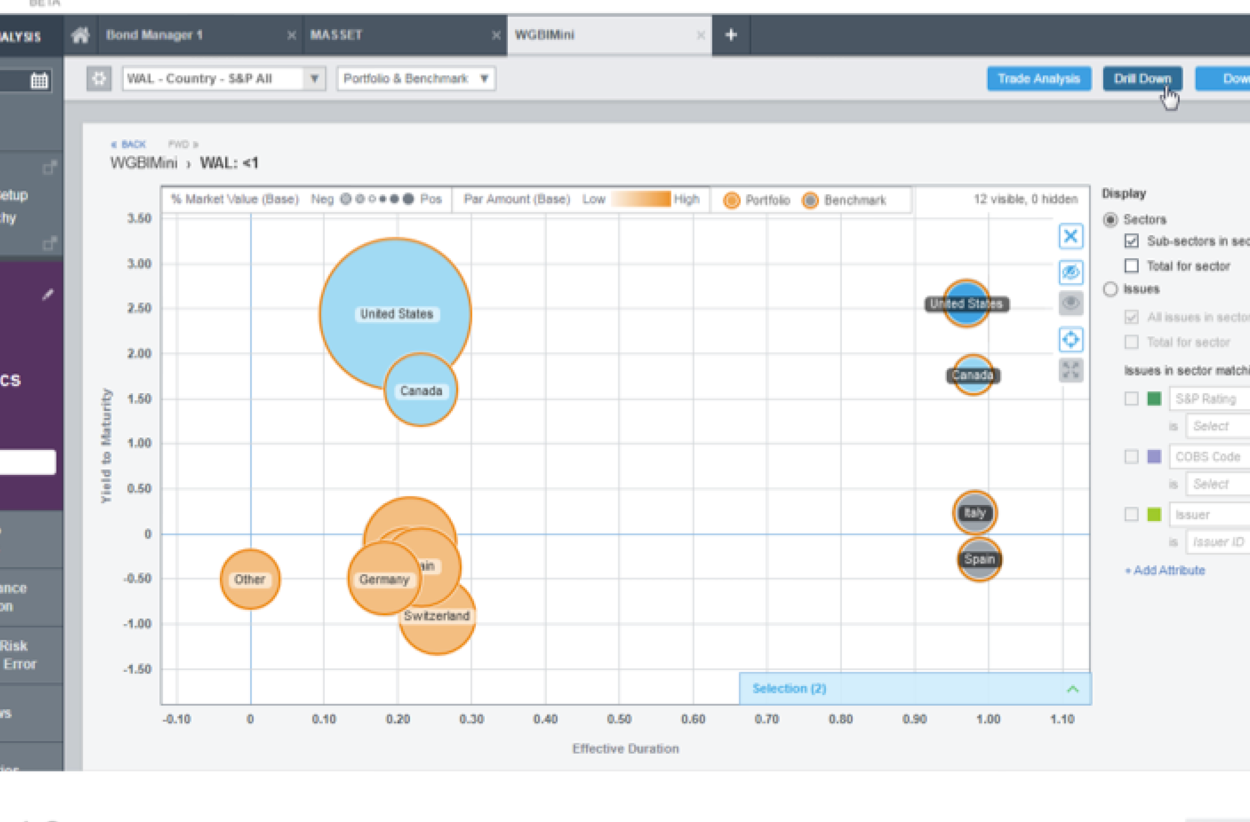
The only change based on client feedback was a simplification of the view-level controls.

Bubble chart in production
Final Specs
Below are the final specifications provided to engineering, along with design rationale for each bubble styling element.


Final specs and design rationale
Project Outcomes
- New client signed immediately following launch, generating $XXXK annual revenue
- Positive feedback from users and stakeholders


